
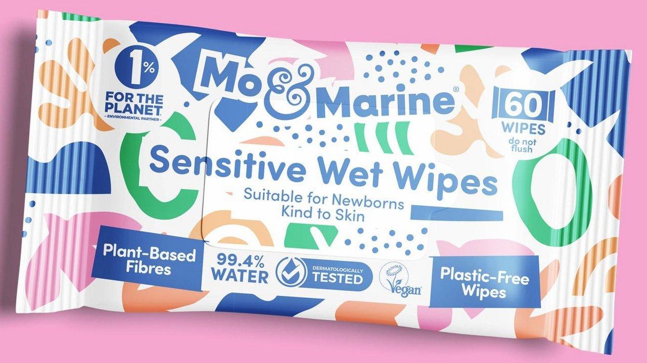
A London design agency has given the baby wipe category a jolt of visual ambition, building an entire brand identity around the uncomfortable question of where wipes end up once they leave the pack. Mo & Marine is a new sustainable baby wipe brand created with Greatergood® Brands, launched against a backdrop of looming UK regulation: a ban on plastic wet wipes due to take effect in spring 2027, and a category responsible for around 94% of the nation’s sewer blockages. Rather than lean on the soft, reassuring visual language that dominates baby care shelves, the brand was built to make sustainable choice feel like the exciting one rather than the dutiful one. The identity draws on three creative territories, land, sea, and air, to dramatise exactly where conventional wipes go wrong. Since launch, Mo & Marine has already picked up award recognition for both product performance and packaging design.
A Category Built On Sameness
Baby care packaging has long relied on a narrow palette of pastel colours and gentle imagery designed to signal safety above all else. That consistency has made it a difficult category for any single brand to stand out in, even when the product inside genuinely differs from its neighbours on the shelf. Mo & Marine’s brief for Greatergood® Brands began from that exact problem: a family with a newborn gets through up to ten packs of baby wipes a month, and most of those wipes end up somewhere they were never meant to be, in landfill, flushed into drains and rivers, or released as pollution when incinerated.
Mo & Marine’s founders had already solved the harder engineering problem, producing genuinely sustainable wipes that perform as well as conventional alternatives. What remained was making that substance visible and desirable at the point of purchase.
Land, Sea And Air As Design Territory
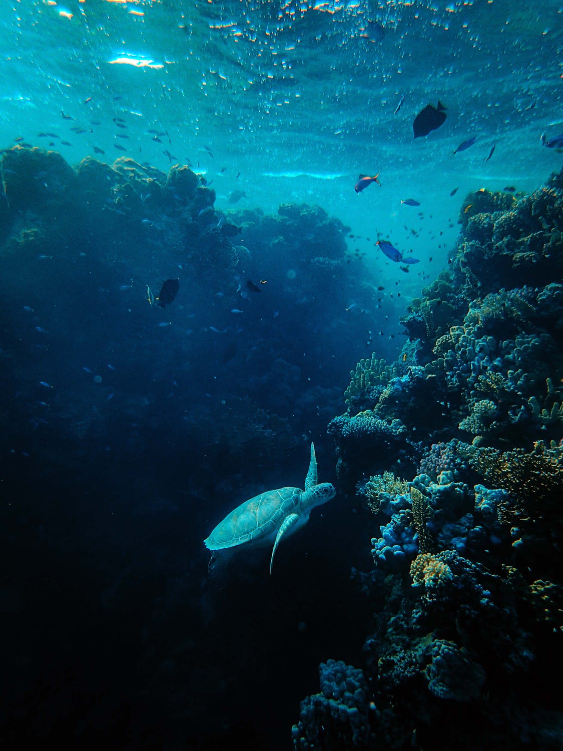
Greatergood® Brands structured the entire visual identity around the three environments where discarded wipes accumulate. Coral reefs, seaweed forms, botanicals, and open sky form a rich illustration system that stands in for land, seas and oceans, and air, turning an environmental warning into a design language rather than a guilt trip. A mid-shade blue was selected as the masterbrand colour specifically because it departs from every pastel and earth tone the baby care category has previously relied on, giving Mo & Marine unmistakable shelf presence.
A Strapline With Some Bite
The tone of the brand rests on the strapline Little Bums Big Ambitions, a line built to capture a truth most parents already sense: that small daily choices are the ones that genuinely accumulate over time. It gives the brand a human, slightly playful register rather than a preachy one, addressing a gap that sustainable baby care products have often struggled to close between environmental credibility and everyday appeal.
Recognition Beyond The Message
Mo & Marine’s reception since launch suggests the approach has resonated beyond its intended niche. The brand has picked up award recognition for both its product quality and its packaging design, evidence that a distinctive identity and a genuinely sustainable formulation can reinforce rather than compete with each other. With plastic wet wipes facing a UK-wide ban from spring 2027 and sewer infrastructure already straining under the weight of wipe-related blockages, brands that can combine performance with a visible environmental story are positioned to matter well beyond the baby aisle.
Mo & Marine’s launch points to a wider shift taking shape across FMCG categories long assumed to be visually settled: that sustainability credentials, once treated as a footnote, can become the central creative idea a brand is built around.